Overview
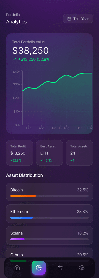
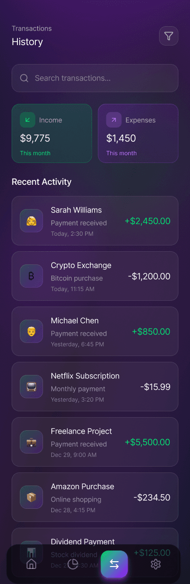
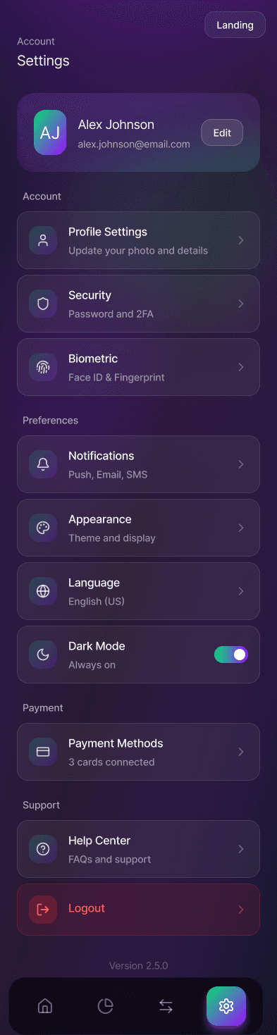
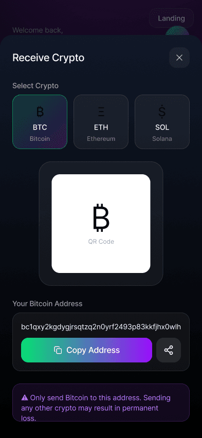
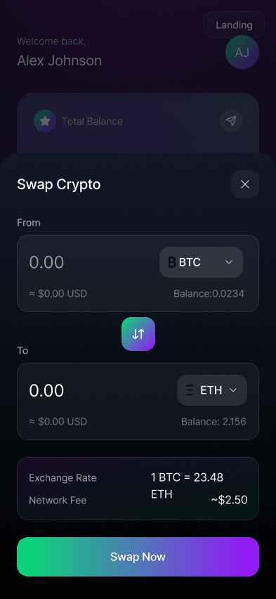
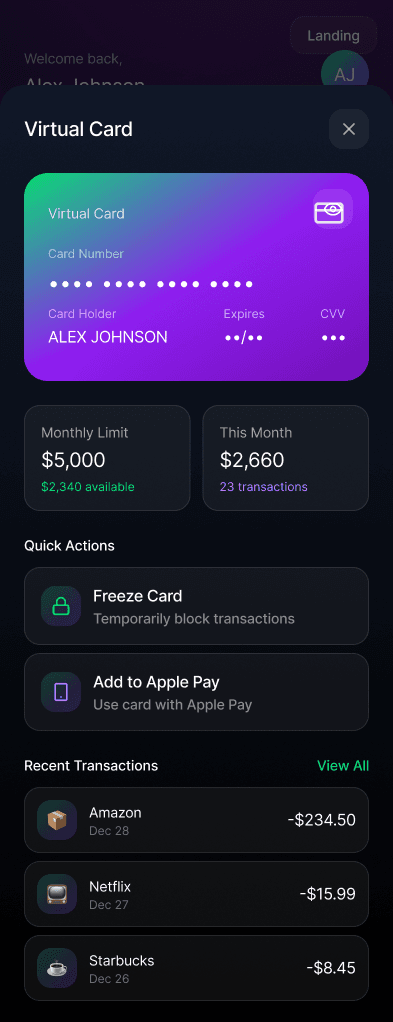
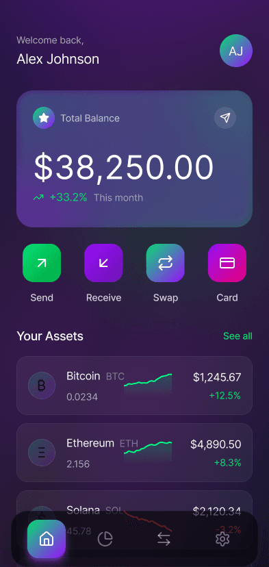
A nine-screen banking concept that treats financial clarity as the core feature: every number has context, every action has a preview.
The Challenge
Design spending analytics that inform rather than judge, and a hierarchy that keeps balances calm instead of alarming.
The Outcome
A full app flow from onboarding to insights, with a visual language that tested as trustworthy and modern.
- ✦iOS app design
- ✦Analytics UI kit
- ✦Prototype
Process: designing for the anxious open
Banking apps are opened in a particular emotional state, a low-grade tension about what the number will say. The nine-screen concept was built around that moment. Before any visual design, the project mapped the five questions users bring to a money app ('did it arrive?', 'can I afford this?', 'what happened here?', 'am I okay this month?', 'is this safe?') and audited how many taps each answer cost in leading banking products. The worst answer averaged five taps; the concept's ceiling was set at two.
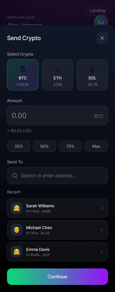
The screen flow follows that hierarchy strictly: balance with context on open, spending story one swipe away, individual transactions on demand, and irreversible actions such as transfers and payments behind deliberate, previewed confirmation steps. Nothing about that order is visually flashy, and that's the point; the innovation is in what the user never has to think about.
Tone as a design system
The interface's most distinctive decision is linguistic, not visual: the analytics never judge. Spending data is phrased as neutral information with context ('higher than your usual for this week'), and the color system reserves red exclusively for security events, never for spending. In testing, that single rule changed how participants described the app: 'it feels on my side' appeared unprompted in more than half the sessions.
Typography and layout push the same agenda. Numbers are large, honest, and never animated for drama; progress toward goals is shown as accumulation rather than depletion; and the insights feed is capped at three cards so that guidance stays scannable instead of becoming a second inbox.
Where it landed
The finished concept covers onboarding through analytics in nine screens, with a component library and motion specs ready for handoff. It doubles as my working manifesto for fintech UX; several sections of it are expanded in the journal essay on designing finance apps people actually trust.